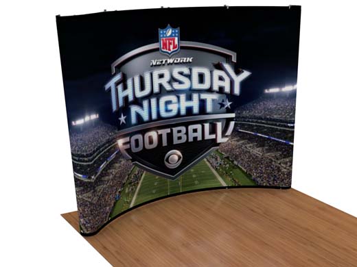
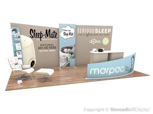
Your trade show display is your stage, and color is your spotlight, drawing in potential clients and conveying the essence of your brand in an instant.
Let's delve into why color is so crucial to your trade show success and explore how you can harness its power to create a captivating display.
The Visual Language of Color
In the realm of visual communication, color serves as a universal language, capable of evoking emotions, conveying messages, and leaving lasting impressions. It stimulates our senses, influences our perceptions, and plays a pivotal role in shaping our preferences and behaviors. From the vibrant hues of a bustling marketplace to the serene tones of a tranquil retreat, color sets the tone and atmosphere, guiding visitors on a sensory journey through your display.
Engaging the Senses
While trade shows offer a multisensory experience, with sights, sounds, and tactile sensations vying for attention, it is the visual allure that often serves as the initial point of engagement. As attendees navigate the bustling aisles, it is the striking colors and bold graphics that catch their eye, beckoning them to explore further. Whether it's the sleek sophistication of a monochromatic palette or the dynamic energy of a kaleidoscope of hues, color commands attention and invites interaction.
The Psychology of Color
Beyond its aesthetic appeal, color wields a profound psychological influence, shaping perceptions, attitudes, and behaviors in subtle yet significant ways. Studies have shown that different colors can evoke specific emotions and associations, tapping into deep-seated cultural and psychological cues. For example, vibrant reds may convey a sense of urgency and excitement, while soothing blues evoke feelings of trust and reliability. By strategically leveraging the psychology of color, you can craft a display that resonates with your target audience and reinforces your brand identity.
Brand Recognition and Recall
In the crowded landscape of trade shows and exhibitions, where countless companies vie for attention, brand recognition is paramount. Your trade show display serves as a visual manifestation of your brand identity, showcasing your logo, colors, and imagery in a cohesive and compelling manner. Research has shown that color plays a pivotal role in brand recognition, with certain hues becoming indelibly linked to specific brands in the minds of consumers. By incorporating your corporate colors into your display, you reinforce brand familiarity and enhance recall, ensuring that your booth stands out amidst the sea of competitors.
Choosing the Right Color Palette
When it comes to selecting the perfect color palette for your trade show display, there are several factors to consider. Naturally, your corporate colors should serve as the foundation, providing a cohesive and recognizable backdrop for your branding efforts. However, beyond your core colors, you have the opportunity to explore different color schemes and combinations that enhance the visual impact of your display.
ANALOGOUS COLOR SCHEME
One approach is to utilize an analogous color scheme, where you select colors that are adjacent to your corporate hues on the color wheel. This creates a harmonious and cohesive aesthetic, with subtle variations that add depth and interest to your display. By working with your designer to explore different shades and tones within the same color family, you can create a visually pleasing backdrop that draws visitors in and reinforces your brand identity.
COMPLEMENTARY COLOR SCHEME
For a more dynamic and eye-catching effect, consider employing a complementary color scheme, where you pair colors that are directly opposite each other on the color wheel. This creates a striking contrast that commands attention and adds a bold, vibrant energy to your display. By juxtaposing opposing colors, you create visual excitement and intrigue, making your booth stand out amidst the competition.
TRIADIC COLOR SCHEME
Another option is the triadic color scheme, where you select three colors that are evenly spaced around the color wheel. This creates a balanced and harmonious palette, with each color serving a distinct role – one as the dominant hue, and the others as accents. By carefully balancing the distribution of colors and their intensity, you can create a visually dynamic display that captures attention and leaves a lasting impression.
Bringing Your Display to Life
Color is not merely a decorative element; it is a powerful tool for communication and expression. From the bold graphics that adorn your banners to the subtle accents that embellish your booth furnishings, every aspect of your trade show display offers an opportunity to infuse color and creativity. Whether you opt for a monochromatic masterpiece or a vibrant mosaic of hues, the key is to stay true to your brand identity while creating a visually compelling experience that resonates with your audience.
By harnessing the power of color to captivate, communicate, and connect, you can elevate your trade show display from ordinary to extraordinary. So, the next time you're preparing for a trade show, remember to think beyond the basics and explore the endless possibilities that color has to offer.
After all, in a world where attention is the ultimate currency, a splash of color can be your greatest asset.
HAVE QUESTIONS OR WANT TO LEARN MORE? GIVE US A CALL 800.336.5019 OR REQUEST A QUOTE TODAY.


